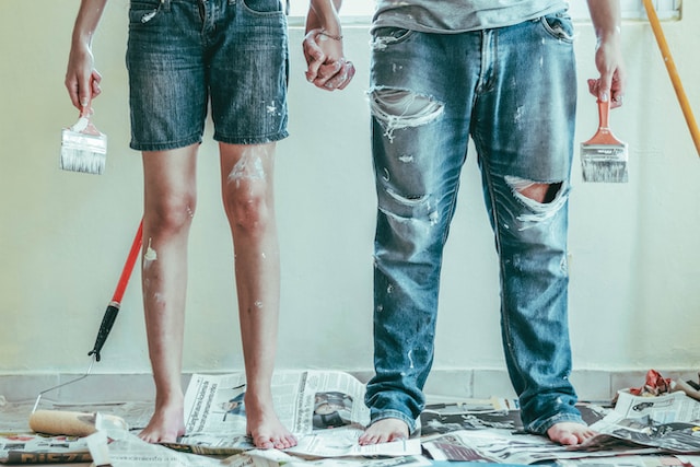
There’s nothing like a fresh coat of paint to give a new home that super-clean feeling. But finding the right color can be tricky.
Minimalists may want to keep it simple, while risk-taking homeowners might choose bold hues. But regardless of your style, you can find plenty of inspiration online.
Color Psychology
Color can be a powerful tool to set the mood and communicate emotions. It can influence decision making and even trigger physiological reactions in the brain. That’s why it’s important for designers to have a strong understanding of how color affects us.
One way to understand how certain hues elicit specific emotions is by studying color psychology. This is a school of thought that studies how different colors evoke feelings in people and can be used as an indicator to determine a person’s personality, temperament and overall well-being.
Some colors can be very powerful, like red, which is associated with excitement, passion and aggression. Other colors have more neutral associations such as gray, which represents balance and calmness. But it is important to keep in mind that each person’s reaction to a particular shade will be different, depending on their personal experiences and individual preferences.
When selecting a paint color, it’s important to consider the room’s purpose and intention. Designer Mehnaz Khan says that she always asks her clients how they want to feel in a particular room and then finds a shade that will best support those needs.
For example, she will ask her clients if they are looking for a relaxing retreat or a bold and energetic space. Then she will recommend a color that best fits that desired mood.
Some colors are universally recognized, like pink for femininity and red for power. Others are more specific, such as green for health and nature. Similarly, brown is known for its natural, earthy qualities and is commonly seen in marketing material for products that aim to appeal to a more traditional audience.
Zodiac Signs
Astrology has become increasingly popular in recent years, and many people are using it to help them make decisions about their homes. For example, a person’s birth date is used to determine their sun sign, which can influence everything from which DIY projects they take on to the color hues they choose for their home.
The twelve zodiac signs are the constellations that the Sun passes through while revolving around Earth. The sun first enters the constellation Aries at the vernal equinox, which occurs on March 20. The signs then rotate through the constellations Cancer, Leo, Virgo, Libra, Scorpio, Sagittarius, Capricorn, and Aquarius. The signs originally aligned with their corresponding constellations when people defined the modern Western zodiac calendar about 2,000 years ago, but due to the slow wobble of Earth’s axis, each sign now takes up about one month less of the year than it did in the past.
Bold and fiery, Aries is represented by the ram. This fire sign loves bold, bright colors like oranges and reds, and they can be impulsive. Taurus is a Venus-ruled earth sign that’s grounded and practical. Roby Antila tells mbg that these folks are dependable and loyal, but they can also be stubborn.
Air signs Gemini and Libra love socializing, reading, and philosophical discussions. These intellectuals can sometimes be a bit scattered, but they’re fun and curious. They love bringing creativity into their homes through decor items and paint shades.
Sagittarians are adventurous and optimistic. If you’re a Sag, consider bringing this sociable sign’s wanderlust into your new home with palettes that feature blues and greens. Consider shades like Unique Gray, Sky High, and Resolute Blue.
Complementary Color Schemes
When you are ready to dive into finding paint inspiration for your new home, consider taking a step back from what you see in magazines or in your friends’ homes and look instead into yourself. This is where many designers start and it’s a great way to find a color palette that suits you, your home, and the desired feeling you want to create. “It could be a gorgeous pillow, a painting you love or even the undertones in your favorite neutral,” says interior designer Maria Killam. “Whatever the inspiration, it should give you a starting point.”
The easiest way to do this is by looking at your favorite colors and determining their complementary counterparts. Complementary color schemes are opposite each other on the color wheel and generate high contrast, making them energizing and vibrant. To find these, select your main color and then locate the two colors directly across from it on the wheel. This will be the second and third colors in your scheme.
Another option is to work with an analogous color scheme, which uses shades, tints and tones of a single hue. This can be a good choice for those who are color-shy or who want to limit the amount of contrast in their space. The color wheel also offers other options, such as triadic and tetradic color combinations. Triadic and tetradic schemes use three or four colors that are evenly spaced around the wheel and offer a balance of vibrancy and stability.
Lastly, there is the split complementary color scheme, which works by selecting one of the colors next to its complement on the wheel and then using the two hues on either side of that color. This type of scheme can be a little tricky to pull off because it requires precise balance. However, if you are willing to try it out, this color scheme can produce some stunning results.
Analogous Color Schemes
Color schemes are a powerful tool in interior design, but creating one that is both beautiful and harmonious takes a bit of skill. Analogous color schemes offer a harmonious way to combine colors, and they are particularly useful when working with more subtle hues. Analogous color schemes are made up of colors that are next to each other on a traditional color wheel, and they often consist of a primary, secondary, and tertiary shade.
Skilled artists have long used analogous color schemes to soften and harmonize their works of art, and it’s no wonder that so many famous pieces of artwork are created using this simple technique. Vincent Van Gogh’s Irises in a Vase, for example, uses the analogous color scheme of green, blue-green, and purple to create a visually pleasing, serene painting.
When it comes to implementing analogous color schemes in your own home, the key is to use subtle tints and shades of each color to avoid overwhelming the room. For instance, in the living room example above, the homeowners chose to use a mix of blue-greens and purples, but they paired them with neutral furniture pieces to keep the space from feeling too busy.
Another great way to use analogous color schemes is by using paint to create a gradient effect on the walls. This can be a beautiful way to add a touch of drama to your room, or it can be used to highlight certain architectural features in your home. For example, you could use paint to create a gradient from a deep red into a soft orange, or you could use it to highlight the ceiling of a vaulted foyer.
Your Favorite Color
Even though you’re probably over the crayon phase, your favorite color from childhood can have a direct correlation with your personality traits. If you know what your favorites mean, they can help guide you to the perfect colors for your home.
If your favorite color is red, it reveals that you are enthusiastic and outgoing. You enjoy socializing and are a good leader. You are also a creative and imaginative person with spiritual beliefs. You are determined to achieve goals but may be a little less intense than those who favor orange.
Green is a color that represents natural, earthy tones and neutral colors. People who prefer this color usually value intelligence, insight, and justice. They are non-conformists and question authority. They tend to be more intuitive and have a keen understanding of their environment.
When choosing paint, be sure to choose a shade that will work with your decorating style and the furniture you plan on using in your room. Look at a few different samples of your favorite color and consider how it will appear in the space at various times of day. This is important because lighting can alter the way a paint color looks, and it can be difficult to accurately determine how it will work with the rest of your decor.
It’s okay to be adventurous and step outside of the box when it comes to your home design, but be sure to take your time with decisions so that you can live with them for years to come. Don’t be afraid to ask for advice from experts and painters at the paint store, and always test your color in your home on a large scale before you make a final decision.